Text reading 'THE JOURNEY' filled with an image of a calm sea, distant mountains, and an island under a cloudy sky.

Raised in Loveland, Colorado, I grew up sketching endlessly, dreaming of becoming a Disney animator. While that path evolved, my passion for visual storytelling only intensified. In high school, I took every art and photography class available, building a strong creative foundation. I chose a college program geared toward graphic design—and opportunity arrived sooner than expected.

A pro bono membership postcard for the Denver Film Society caught their attention so strongly that I was hired as the graphic designer for the prestigious Starz Denver Film Festival before graduating. My dean, impressed by this real-world achievement, allowed me to finish my degree ahead of schedule.

Like the wake trailing behind a boat on calm Alaskan waters—marking steady progress while reflecting the journey thus far—my career has been one of continual forward motion: blending high-stakes event design, thoughtful brand identities, and collaborative freelance projects. Always driven to craft visuals that solve challenges, forge connections, and bring bold ideas vividly to life.

Orange downward arrow inside a circle on white background.

DENVER FILM SOCIETY

Downtown Denver skyline at sunset with Starz Denver Film Festival 2008 and Starz Denver Film Festival - Vote Film 2012 graphics overlay.

Promoting Cinematic Experiences Through Design

Background:

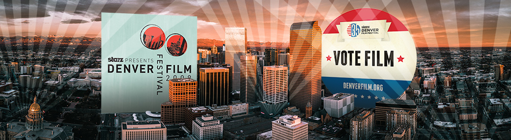
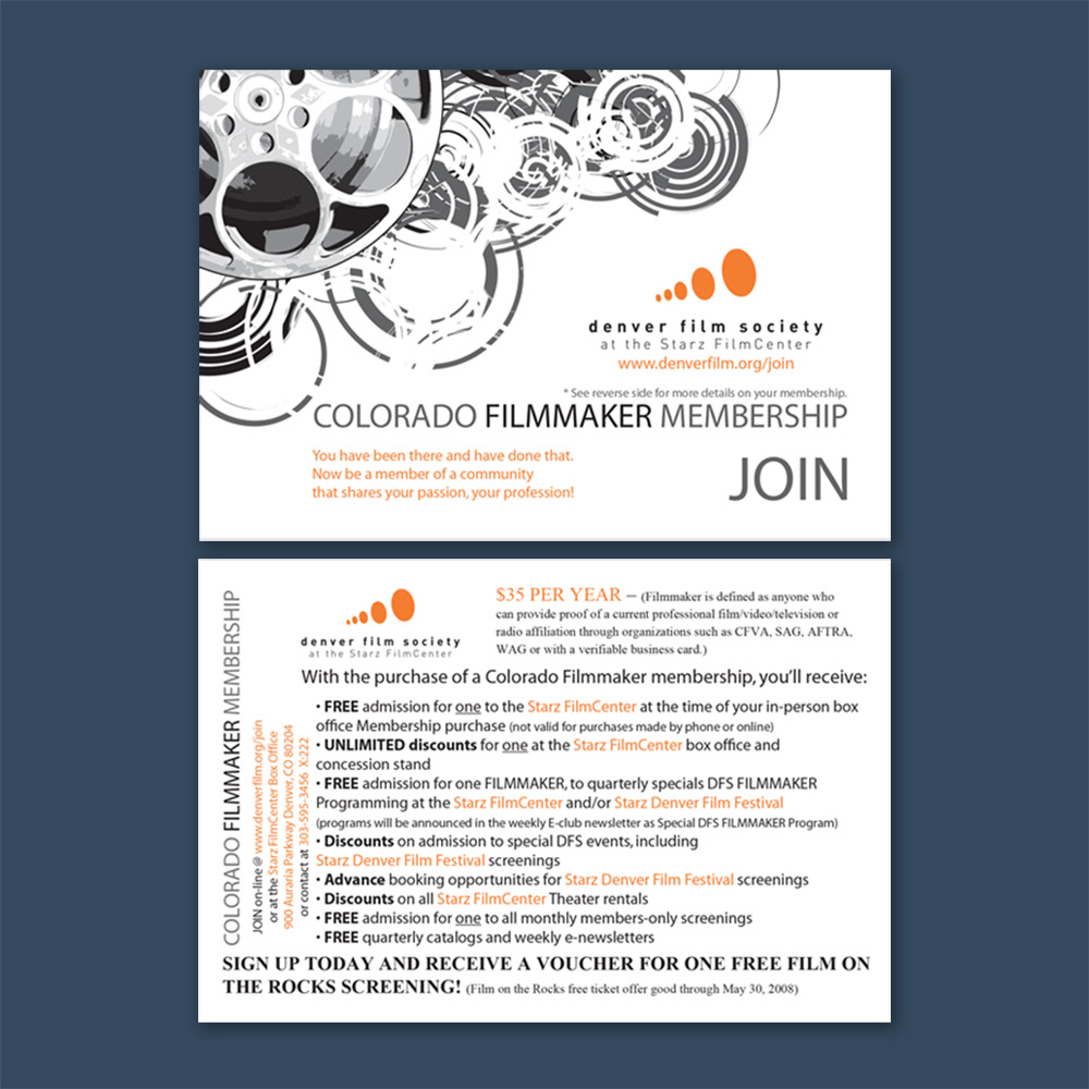
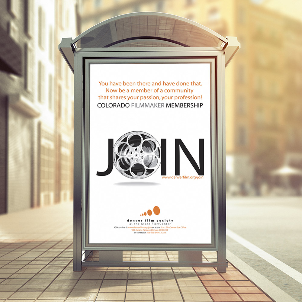
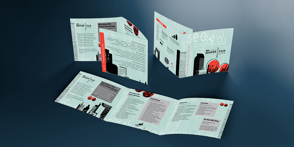
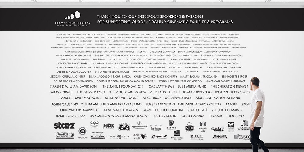
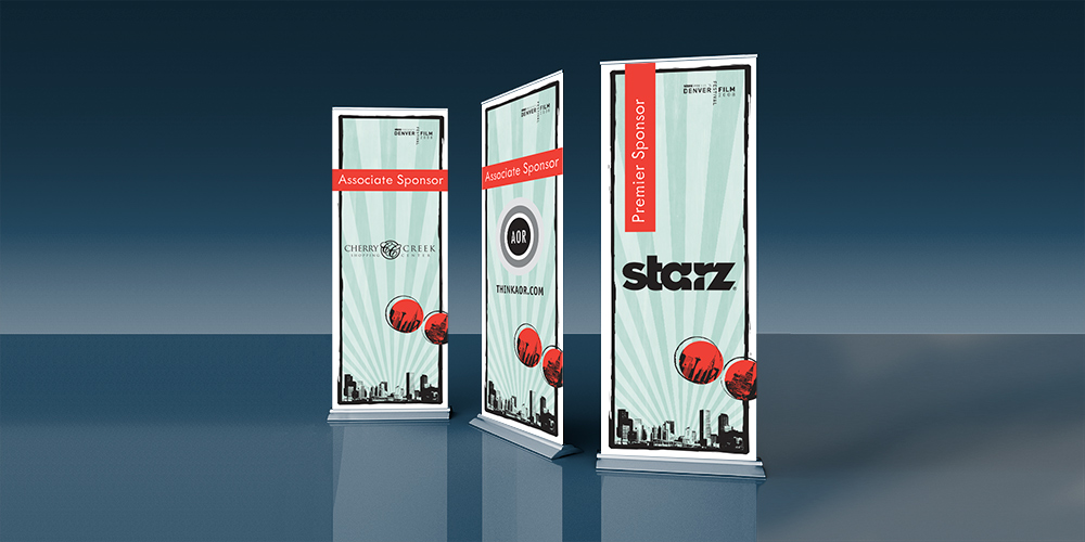
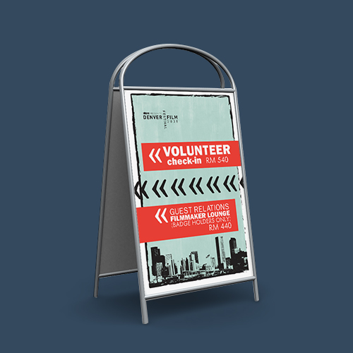
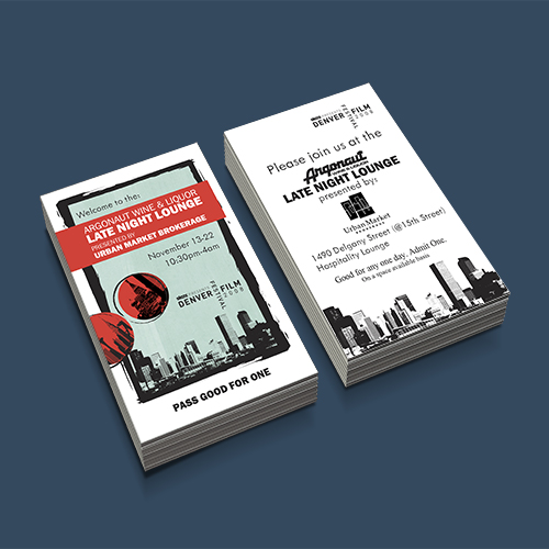
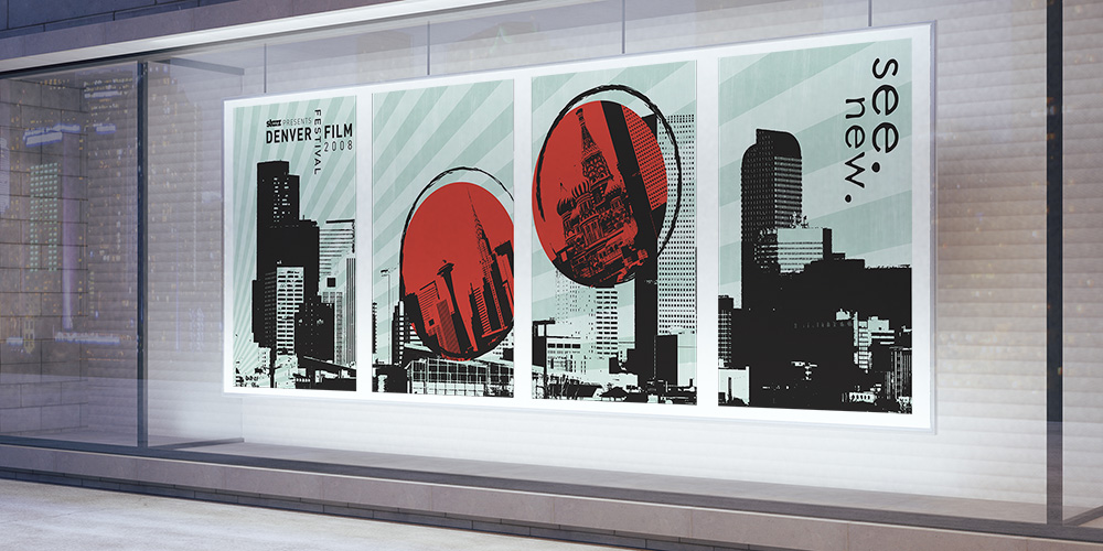
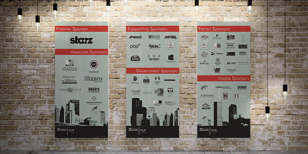
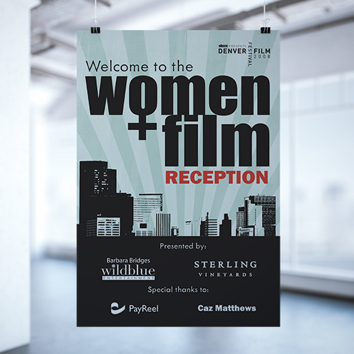
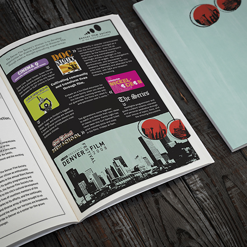
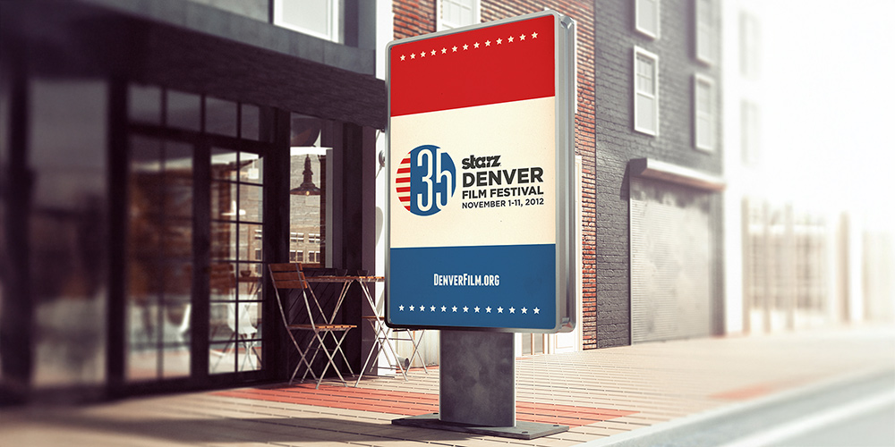
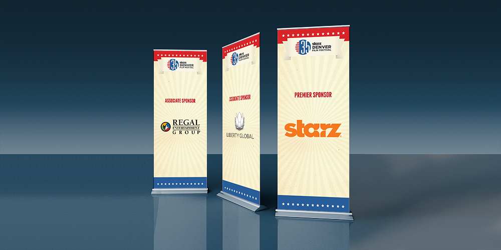
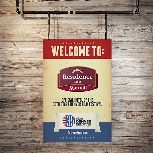
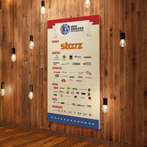
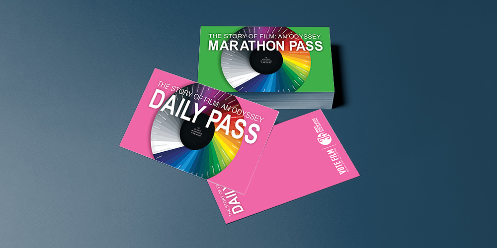
The Denver Film Society, a non-profit dedicated to fostering diverse audiences’ appreciation of film through creative and thought-provoking experiences, hosts the annual Starz Denver Film Festival. In 2008 and 2012, I served as their Graphic Designer, creating promotional materials to elevate the festival’s visibility and impact.

Challenge:

Develop a cohesive suite of promotional materials for the Starz Denver Film Festival that reflects the organization’s mission, ensures brand consistency, and provides proper recognition for donors and patrons, all under tight deadlines and high-pressure event timelines.

Design Process:
Outcome:

The promotional materials successfully elevated the Starz Denver Film Festival’s brand, delivering visually striking and cohesive designs that enhanced donor recognition and audience engagement. The work contributed to the festival’s professional presentation and reinforced its mission of celebrating film as a cultural experience.

PROBONO

31ST STARZ DENVER FILM FESTIVAL

Denver Film Festival Invite

Three views of a tri-fold brochure for the Denver Film Festival 2008 featuring black city skyline graphics and red circular accents on a light blue background.

Donor Wall

Denver Film Society donor wall featuring a list of sponsors and patrons in black text on a white background with logos at the bottom and a man in a white shirt standing on the right.

Sponsorship Banners

Three vertical sponsorship banners for the Denver Film Festival showing Associate Sponsor Cherry Creek Shopping Center, Associate Sponsor AOR with thinkaor.com, and Premier Sponsor Starz.

Awning Posters

Window display featuring four posters with stylized city skylines, red circular highlights, and text referencing the 2008 Denver Film Festival and the phrase 'see new.'

Sponsorship Banners

Three vertical sponsor banners hanging against a brick wall with exposed hanging light bulbs above.

35TH STARZ DENVER FILM FESTIVAL

Film Festival Sign

Outdoor sign for the 35th Starz Denver Film Festival held November 1-11, 2012, with red, white, and blue colors and the website DenverFilm.org.

Sponsorship Banners

Three vertical sponsor banners for the 36th Denver Film Festival featuring Regal Entertainment Group, Liberty Global, and Starz as sponsors.

Event Pass

Stack of green 'Marathon Pass' cards and two pink 'Daily Pass' cards for The Story of Film: An Odyssey on a blue surface.
Orange downward arrow inside an orange circle.

OPENFOG CONSORTIUM

Logo of OpenFog featuring blue text with a partial yellow circle and green wave underneath.
Two variations of the OpenFog logo side by side, one in white and the other in multicolor on a dark background with a swoosh beneath each.
Three vertical panels showing starry night sky over mountains in blue, yellow, and green color filters with corresponding hex color codes #4870B4, #EFC03B, and #63AF59 displayed.

A Global Identity for IoT Innovation

Background:

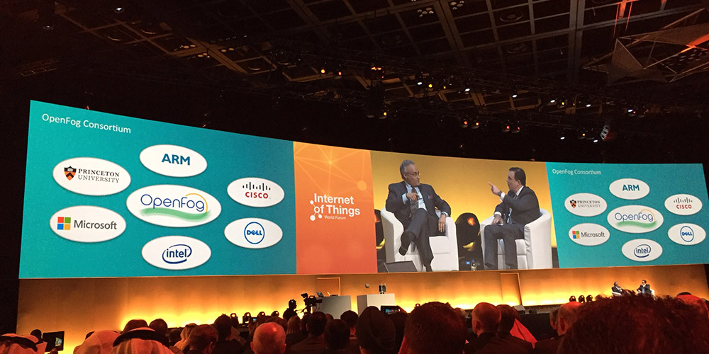
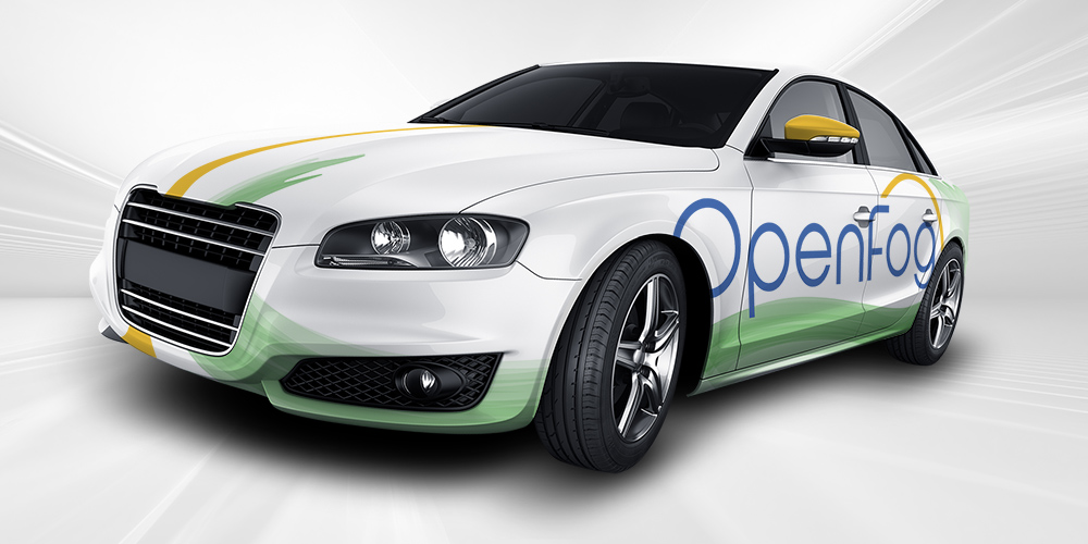
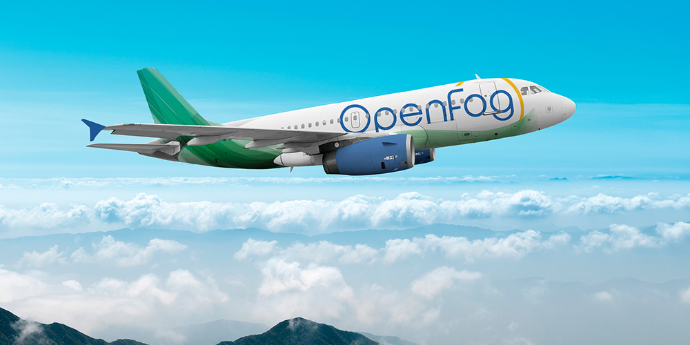
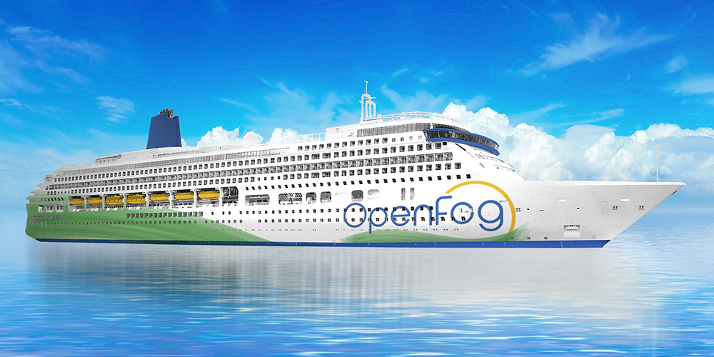
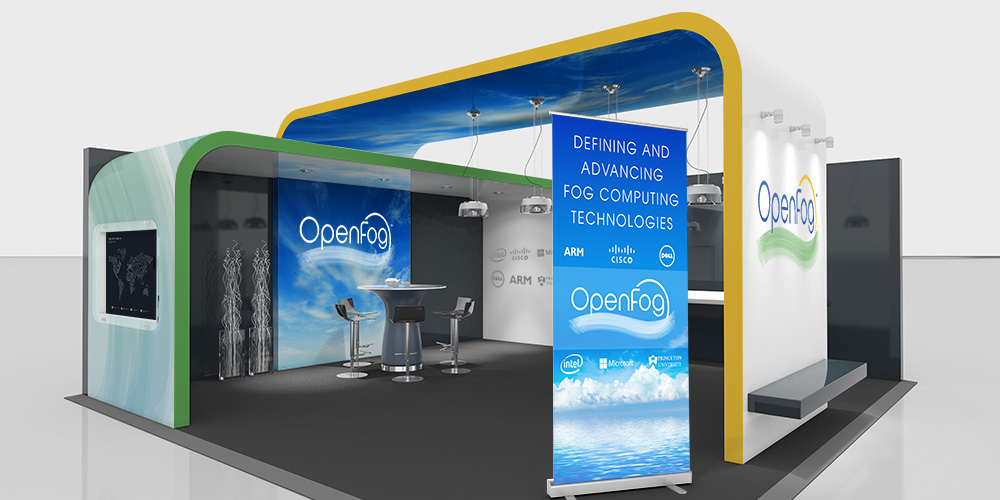
The OpenFog Consortium (OFC), a coalition of technology industry leaders, aims to set standards for the Internet of Things (IoT), enabling smart, interconnected systems through cloud computing and sensor networks.

Challenge:

Design a globally recognized logo that represents the collaboration of multiple industry leaders and conveys the innovative, forward-thinking nature of IoT standards.

Design Process:
  • Discovery: Worked closely with the OFC committee, including its president, to understand the consortium’s mission and global impact.
  • Conceptualization: Developed logo concepts that balanced innovation and inclusivity, reflecting the collaborative nature of the consortium.
  • Collaboration: Iterated designs through close partnership with the committee, ensuring the logo met diverse stakeholder needs.
  • Outcome: The final logo, now in the process of becoming a registered trademark, has been successfully introduced at trade shows and notably featured by Cisco’s president, Anil Menon, at the Internet of Things World Forum in Dubai. It effectively represents the OFC’s leadership in shaping IoT standards.

Founding Members

Dell company logo in navy blue circle.
Intel logo
ARM logo in dark blue text on a white background.
Princeton University logo with shield emblem and text.
Cisco brand name with a stylized digital signal above the text.
Microsoft company logo with four blue squares arranged in a grid.

Internet of Things World Forum in Dubai

Two men seated on stage in conversation at a conference with large screens behind displaying OpenFog Consortium and sponsor logos including ARM, Cisco, Dell, Microsoft, Intel, and Princeton University.

Mockups

Marvelous, let’s continue
Orange downward arrow enclosed in a circle on a white background.

Delvehound Brewing Company

Logo of Delvehound Brewing Company featuring a dog digging in front of a wooden fence within a circular emblem.
Two versions of Delvehound Brewing Company logo featuring a hound dog digging downward above the company name on a dark blue background.
Color palette featuring shades of blue, brown, and beige with close-up images of a dog in the background.

Crafting a Brand from Passion

Background:

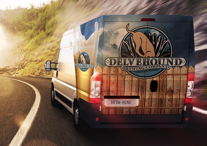
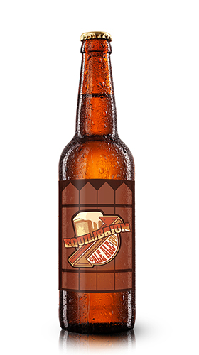
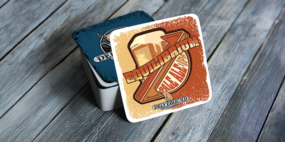
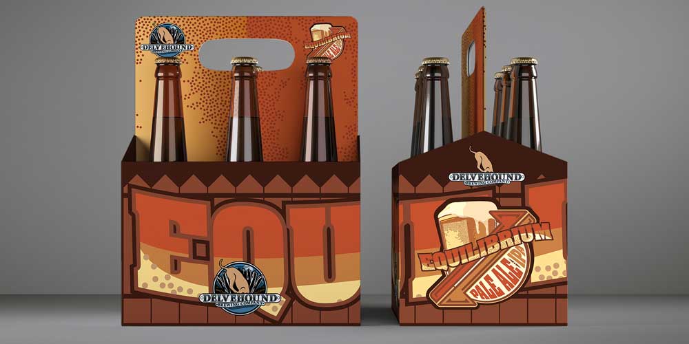
Delvehound Brewing Company, a small-scale craft brewery, sought a visual identity that captured its founder's passion for brewing exceptional beer while staying true to its roots as a heartfelt garage hobby. The brand needed to incorporate their beloved bloodhound, Arlow, and evoke a traditional, community-driven aesthetic.

Challenge:

Create a cohesive brand identity that translates the founder’s brewing expertise and personal story into a compelling visual narrative, emphasizing Arlow and the brewery’s authentic, non-mainstream ethos.

Design Process:
  • Discovery: Collaborated with the founder to uncover the essence of Delvehound—a craft brewery rooted in friendship and tradition, centered around Arlow’s mischievous yet loyal personality.
  • Conceptualization: Developed a logo featuring Arlow delving into the earth, symbolizing curiosity and exploration, core to the brand’s spirit.
  • Color Palette: Selected earthy tones—deep browns, tans, and blues—to reflect Arlow’s fur and the warmth of home brewing.
  • Typography: Chose a classic typeface with historical character to align with the traditional brewing ethos, ensuring each label felt like a story.
  • Outcome: The final logo and brand identity embody Delvehound’s values of friendship, craft, and community, creating a memorable and authentic visual presence.
Tall glass of amber beer with foamy head and Delvehound Brewing Company logo featuring a dog and broken fence.
Delivery van with Delvehound Brewing Company logo and design driving on a winding road.

Delvehound Brewing: Equilibrium

Fashioning Visual Harmony for a Signature Beer

Background:

Equilibrium, Delvehound Brewing’s signature beer, is a balanced blend of pale ale and IPA, featuring a mildly sweet, complex flavor from crystal malt and floral, citrusy notes from Centennial and Cascade hops.

Challenge:

Design a brand identity for Equilibrium that reflects its unique flavor profile and integrates seamlessly with Delvehound’s broader brand, ensuring shelf appeal and brand consistency.

Design Concept:
  • Conceptualization: Created a label design that mirrors the beer’s balanced nature, with a focus on its refreshing and effervescent qualities.
  • Color Palette: Used warm, earthy tones to echo the beer’s amber hue and the brewery’s artisanal roots, tying it to the core brand identity.
  • Typography: Selected a bold, rustic typeface to convey strength and tradition, with “Equilibrium” prominently displayed to highlight balance.
  • Imagery: Incorporated a stylized, foaming beer mug to symbolize refreshment, linking to the brewery’s Arlow logo for brand cohesion.
  • Packaging: Extended the design to bottles and six-pack carriers, using a simplified logo for recognizability and enhanced brand recall.
  • Outcome: The Equilibrium identity captures the beer’s unique flavor and aligns with Delvehound’s brand, creating a cohesive and visually striking product line.
Brown glass beer bottle with a label featuring the text 'Equilibrium' and a design of a beer mug with frothy head.
Stack of square beer coasters on a wooden surface, with the top coaster featuring a frothy beer glass, the words 'EQUILIBRIUM PALE ALE IPA,' and the Delvehound Brewing Company logo.
Two six-packs of Delvehound Brewing Company’s Equilibrium Pale Ale with orange and brown packaging and a dog logo.
Orange downward arrow enclosed in a circle.

Goodfellas Audio/Video

Goodfellas Audio Video logo with a film strip and speaker on a dark background.
Four variations of the Goodfellas Audio Video logo featuring a diamond shape with filmstrip and speaker icons, and the company name in bold text.
Two side-by-side images of theater seats with dark navy #031926 on the left and light gray #FFFFFF on the right, each labeled with numbers and color codes.

A Cinematic Brand Refresh

Background:

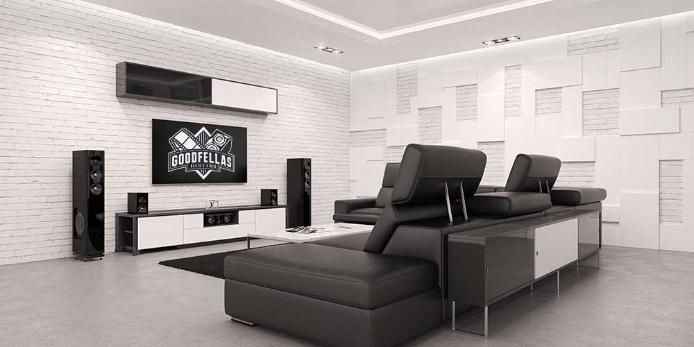
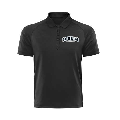
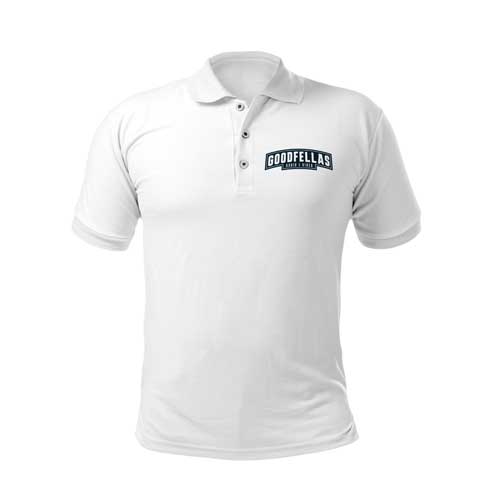
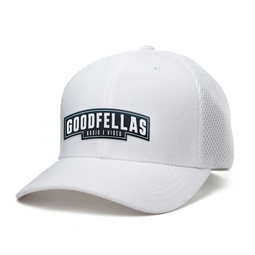
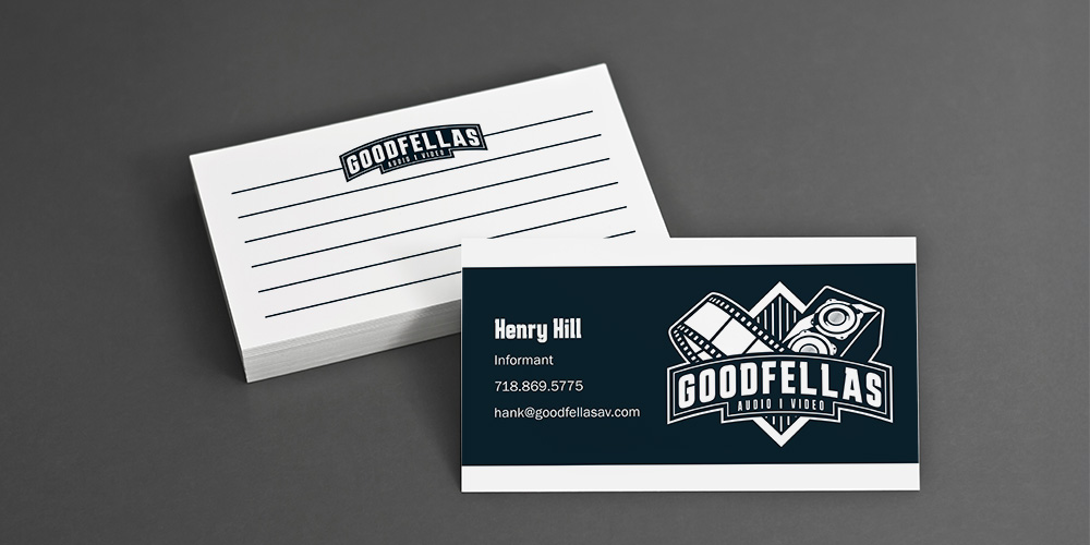
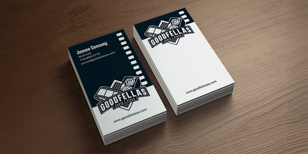
GoodFellas Audio/Video, a rebrand of SunTronics-AV, specializes in home theater systems, automation, and network design. Inspired by classic mobster films like GoodFellas and The Godfather, the company sought a refreshed identity that balanced technical expertise with a playful, cinematic theme.

Challenge:

Develop a logo and brand identity that reflects GoodFellas-AV’s technical prowess and passion for cinema, incorporating symbolic elements like film reels and speakers while maintaining a sophisticated yet approachable aesthetic.
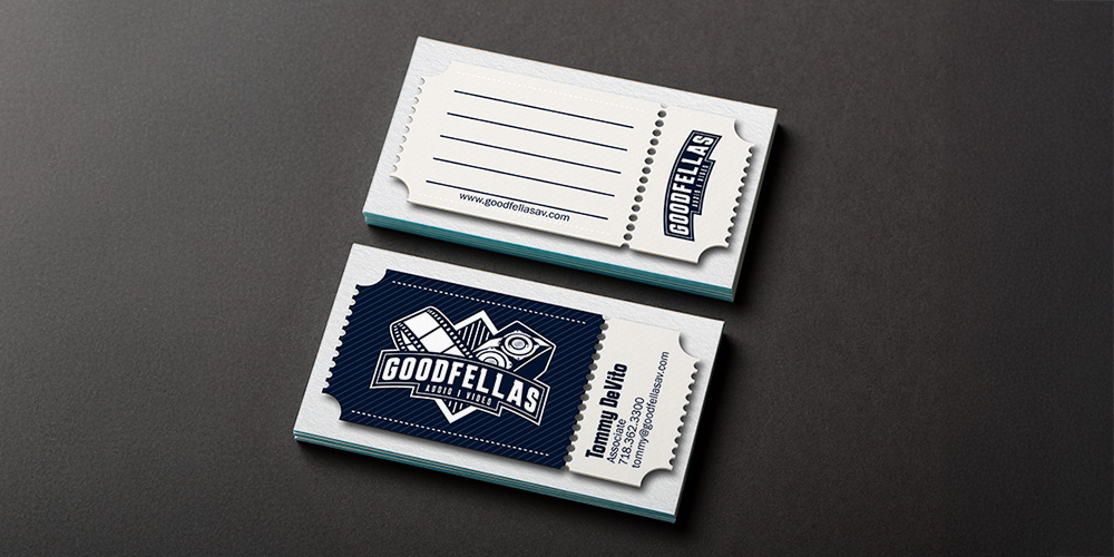
Design Process:
  • Discovery: Explored the client’s vision, distilling symbolic elements like marionette strings and popcorn into a cohesive concept tied to cinema and audio expertise.
  • Conceptualization: Designed a logo featuring a film reel and speakers, representing the visual and audio components of home theater systems.
  • Color Palette: Chose a sleek, neutral palette to convey professionalism while allowing the cinematic theme to shine.
  • Typography: Selected a bold, classic font to evoke vintage Hollywood and ensure readability, aligning with the mobster-inspired theme.
  • Outcome: The refreshed brand identity positions GoodFellas-AV as a dynamic, cinematic, and technically proficient brand, resonating with both tech-savvy and film-loving audiences.
Modern home theater room with black leather sectional sofa, large flat-screen TV displaying Goodfellas logo, floor-standing speakers, and white brick walls.

Uniforms

Business Card Design

Orange downward arrow inside a circle on a white background.

Suntronics Audio/Video

SunTronics logo with a sun wearing sunglasses and headphones between the words 'Sun' and 'Tronics'.
Four variations of the SunTronics logo featuring a stylized sun wearing sunglasses integrated with the text.
Two stylized suns with wavy rays wearing sunglasses and headphones, side by side on a dark blue background.
Four vertical panels with color codes #454545 (dark gray), #EE6823 (orange) showing a man with headphones, #FDD600 (yellow) showing a man with sunglasses, and #FEF5F5 (light gray) with soundwave patterns in the background.

A Vibrant Identity for a Tech Innovator

Background:

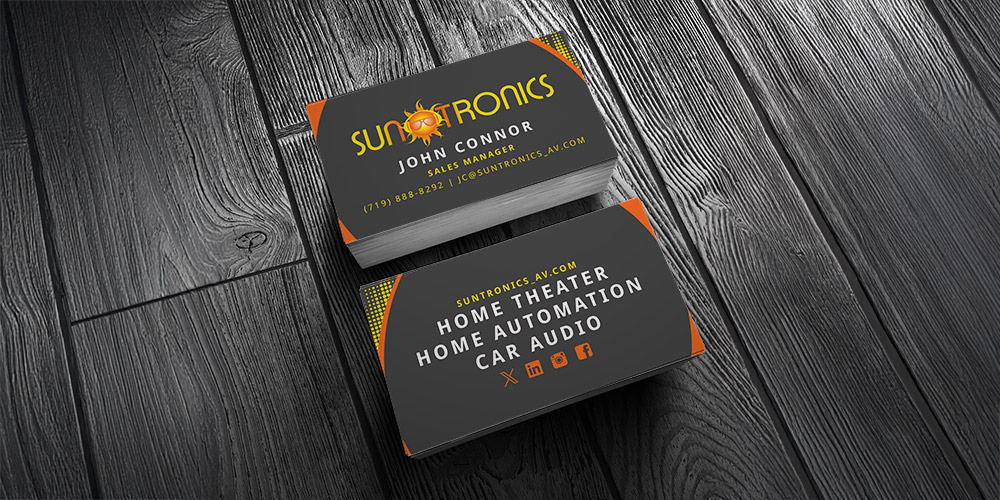
SunTronics-AV, a start-up in consumer electronics, specializes in home theater installation, whole-home audio, automation, network design, and custom automotive audio. The company needed a bold, modern brand identity to stand out in a competitive market.

Challenge:

Create a dynamic logo and identity that embodies a fun, hip, and youthful vibe while reflecting SunTronics-AV’s diverse, innovative services and appealing to a tech-savvy audience.

Design Process:
  • Conceptualization: Developed a sun icon stylized with headphones and sunglasses to symbolize warmth, creativity, and a modern, lively spirit.
  • Color Palette: Used vibrant, energetic colors to convey innovation and approachability, aligning with the brand’s youthful aesthetic.
  • Typography: Chose sleek, bold lettering to ensure readability and complement the contemporary feel of the icon.
  • Outcome: The SunTronics-AV identity establishes the brand as a trendy, professional player in the electronics retail space, creating a strong and memorable market presence.

Business Card Design

Two black business cards with orange accents for Suntronics, displaying contact info and services like home theater, automation, and car audio.
Orange downward arrow inside a circle on a white background.
Modern commercial building exterior with text overlay reading 'Real Estate Marketing'.